website design
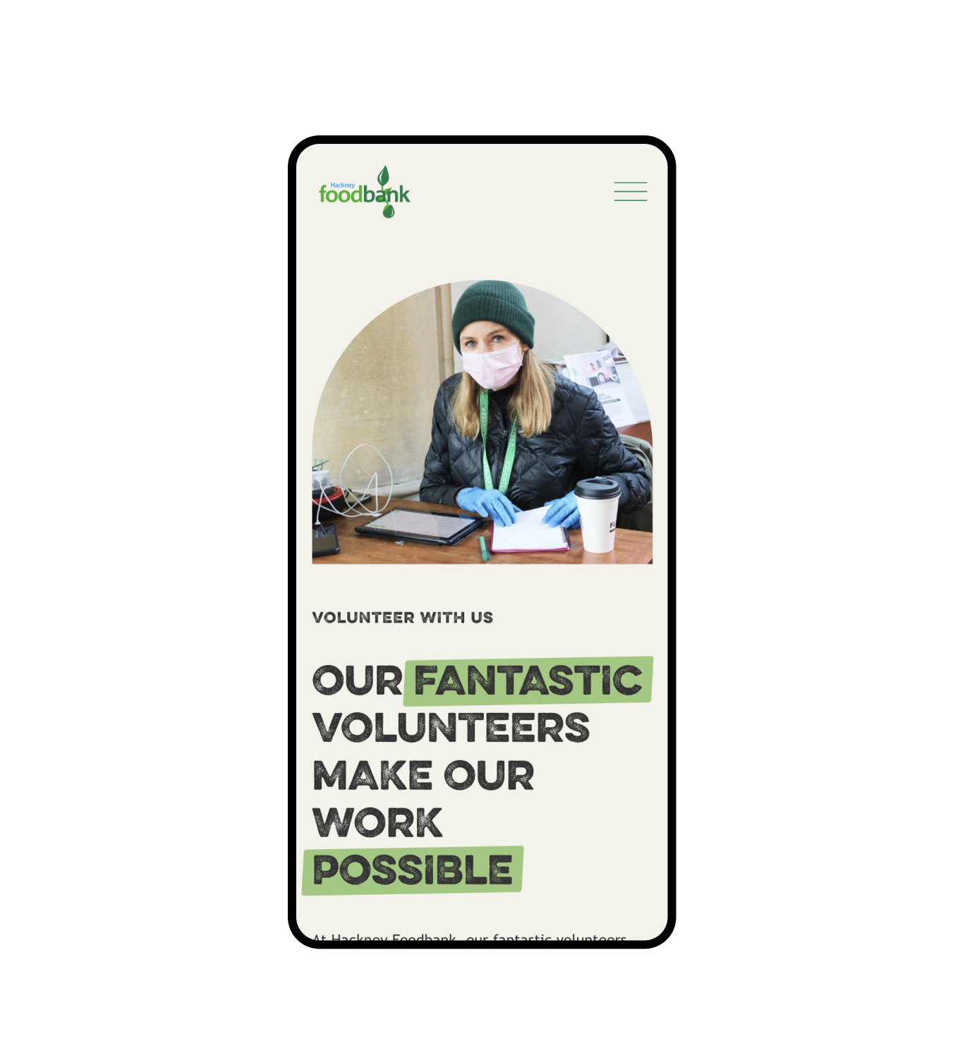
Hackney Food Bank Squarespace website design
Studio 77 was excited to design and build a Squarespace website that helped Hackney Food Bank gain control of their website, take more donations and aid more people looking for help. We love working with non-profit and charity organisations because we can create something that will help a greater community.
Project overview
The design intention was to make the site fill people with hope and positivity and take away any stigmas or prejudices towards asking for help. Hackney Food Bank plays a vital role in people's lives when they most need it, and the website needs to reflect that.
Working with Ruby and her amazing team was an absolute pleasure. They made the process of building a new website very easy for us during a very busy time and they were so responsive. Really efficient and thought out work done by such a wonderful team!
hackney food bank
Squarespace website design goals
An essential approach to this website was accessibility; the food bank is widely used by lots of people from all different communities and backgrounds; we used Hackney Food Banks' existing branding and streamlined the UI to make sure visitors got the information they needed fast, using illustrations and stand-out call to action's to fast-track their journey.
Clear and guided information through out the site.
In terms of strategy, the website's crucial goal was to increase usability and make all the information more accessible. As a result, we prioritised highlighting critical details such as opening hours and locations.
The three key intentions of visitors to the site are; "looking for help", "looking to help", and "looking to donate", so immediately when you go to the website, you have those three funnel routes available.
With people from all nationalities visiting the website, we also focused on using illustrations and icons to help guide every user through the information.
The Squarespace website design
The home page has an incredibly unique triangular split first section that sparks positivity into the very beginning of the site.
We incorporated over twenty branded illustrations to help bring vibrancy to the design as well as to help guide visitors through the information. This includes coding in GPS pin, mobile and e-mail icons to replace bullet points to make the information even more visually apparent.
Bespoke Squarespace Training
We teach our clients how to use and update their websites with our bespoke video training at the end of the project; it's important that they know how to edit and maintain their websites themselves. Our clients often say updating their websites after the training is simple and easy to do.
We also offer Squarespace maintenance packages for those who need additional help or are too busy wearing all of the other business-owner hats.
Get your dream non-profit or charity website design today.
If you have a one-of-a-kind charity and you’re looking for a website to match, we’re here for you! Get in touch with our expert design team today, and let’s start your creative journey together.


