website design
Do It Now Now Squarespace Website Design
Studio 77 was excited to design and build a Squarespace for "Do It Now Now"; an inspiring organisation dedicated to fighting for social equity and equality for Black communities.
Project overview
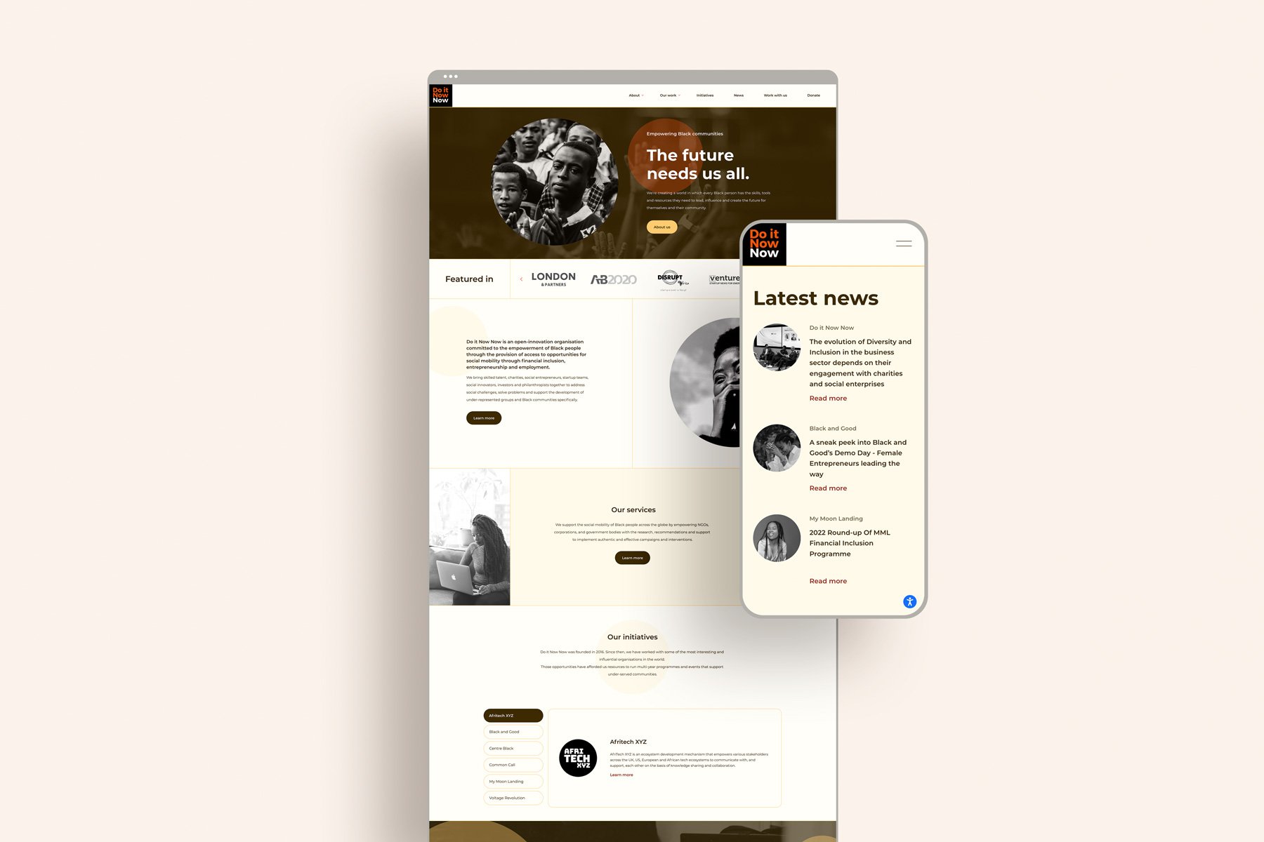
The main goal of the new design was to create a more friendly and welcoming site that draws people into reading articles about the organisation's great work. Overall it needs to be a site that allows the user to be guided through the variety of work it does with ease.
“Ruby and her team are always so helpful in helping us constantly evolve our site as we grow. It's a pleasure to work with them and would definitely recommend.”
Rebecca maserow, do it now now
Squarespace website design goals
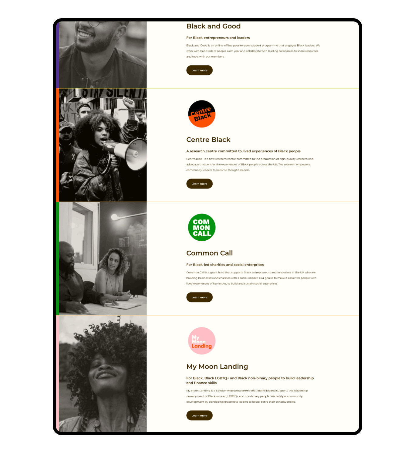
"Do It Now Now" is the umbrella initiative for the charity's six other initiatives to tackle inequality in every sector. The challenge was to design a website that had consistent branding and messaging for the leading charity and incorporated all the great content that the six initiatives offer.
The website's overall goal is to inform and get people to read stories and blogs about all the fantastic work the charity does to impact change, drive people towards signing up for newsletters and boost outreach.
Ease of access to an abundance of information
There are many ways to interact with the organisation, so the most significant goal in the strategy sessions was funnelling visitors to where they needed to go with ease.
We’ve done this in several ways, by firstly having the critical items in the header at all times, then throughout the pages having various “call to action’s” that guide visitors to where they may want to go.
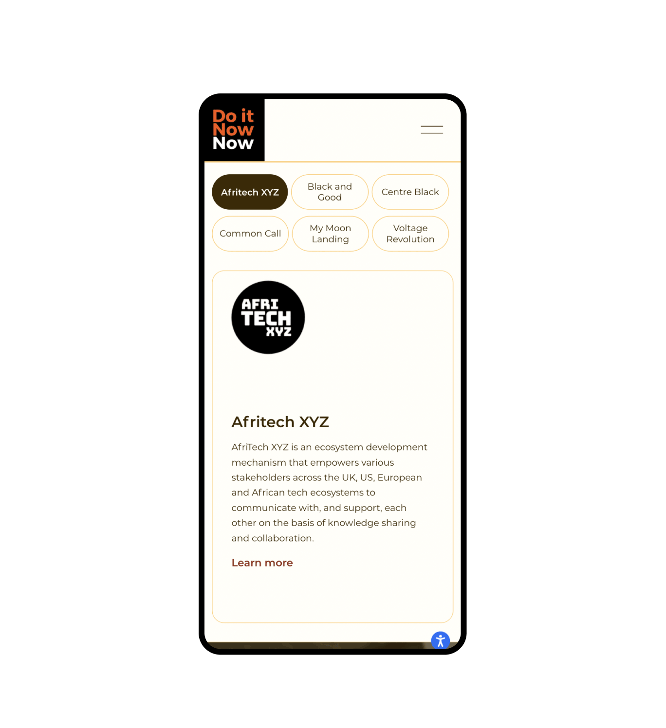
Finally, we implemented some code to create a selection-based function to guide the visitor through the initiatives and give details on what the initiatives do with a ‘call to action’ button to find out more.
The Squarespace website design
The use of circles on this website is to represent inclusivity and welcome. These circles are used to draw focus to headings and specific “calls to action”, and they’re also mirrored in the rounded buttons and borders.
We have used primarily monochromatic colours with a pop of orange to draw attention to critical areas.
Bespoke Squarespace Training
We teach our clients how to use and update their websites with our bespoke video training at the end of the project; it's important that they know how to edit and maintain their websites themselves. Our clients often say updating their websites after the training is simple and easy to do.
We also offer Squarespace maintenance packages for those who need additional help or are too busy wearing all of the other business-owner hats.
Get your dream non-profit or charity website design today.
If you have a one-of-a-kind charity and you’re looking for a website to match, we’re here for you! Get in touch with our expert design team today, and let’s start your creative journey together.


