The Squarespace Showcase Edit 01: Studio Sonder
Since we launched in 2017, we’ve been using Squarespace to create beautifully bespoke websites. Over the last year, we’ve launched countless numbers of Squarespace websites, through both our bespoke website design and build service here at Studio 77, and also through our sister company Squarebase, which sell plug-and-go Squarespace website templates.
We thought it was about time we collated our favourite Squarespace websites that we’ve built and shared them with you for some Squarespace inspiration with our new series, The Squarespace Showcase!
We love using Squarespace as a platform to build our clients websites on because it’s easy for our clients to use to maintain their website, and it gives us plenty of freedom to do our thang (not that’s not a typo) with our advanced knowledge of Squarespace coding.
It really is a win-win situation!
The Squarespace Showcase 01: Studio Sonder
In our first edition of The Squarespace Showcase, we’re shining a spotlight on copywriting agency, Studio Sonder. Founded by Charlotte Moore, Studio Sonder was created because she felt that editorial style copy was overpriced and overcomplicated. Her aim with her business was to keep it simple and work with a small volume of clients at the early stages of their business. Charlotte and Studio Sonder recently won the Made in Manchester award "Creative Brand of The Year 2021" - Go Charlotte!
Studio Sonder’s Squarespace website objectives were:
Get to number one on organic SEO for the search term: Studio Sonder (was previously 6th)
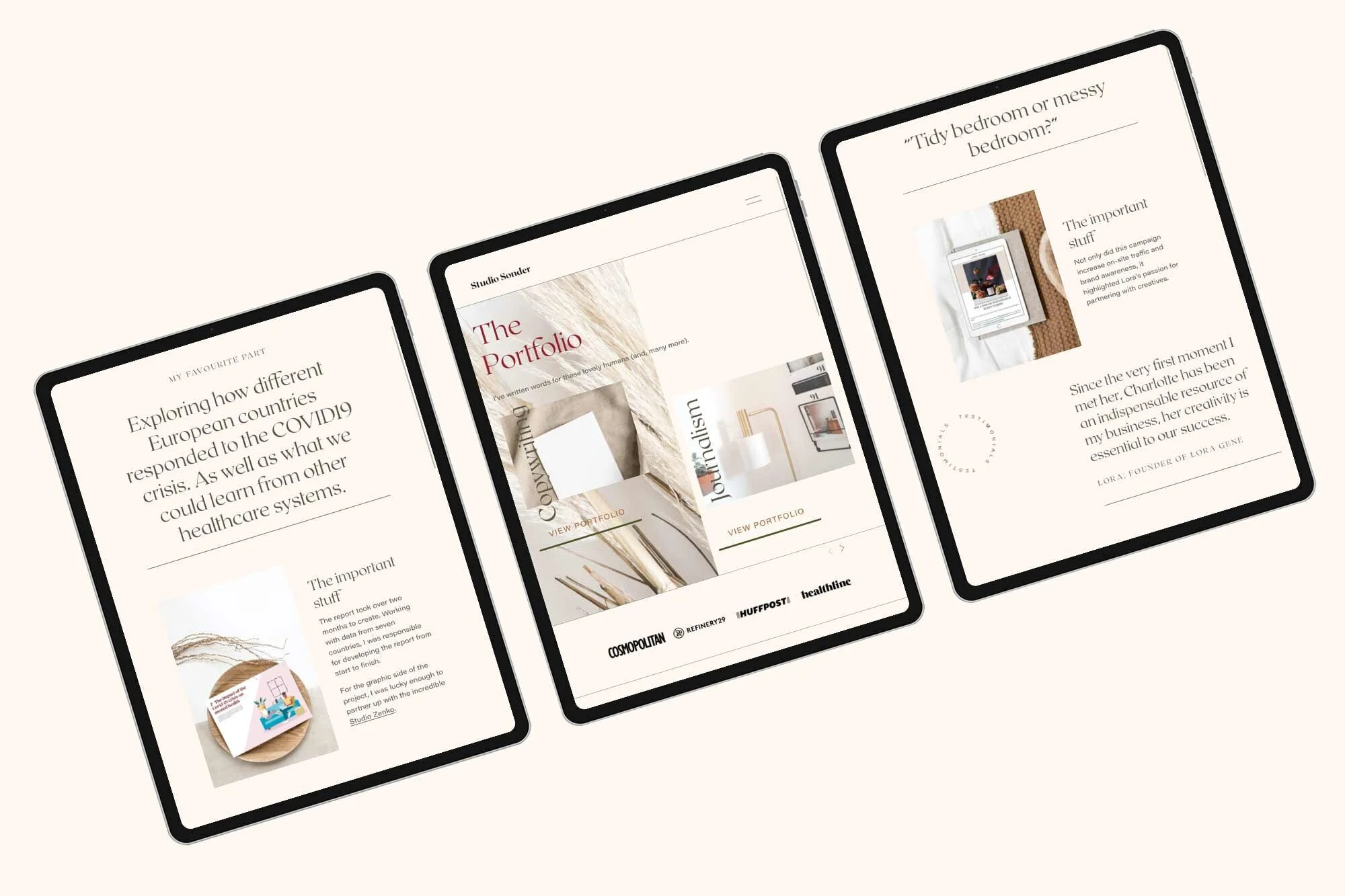
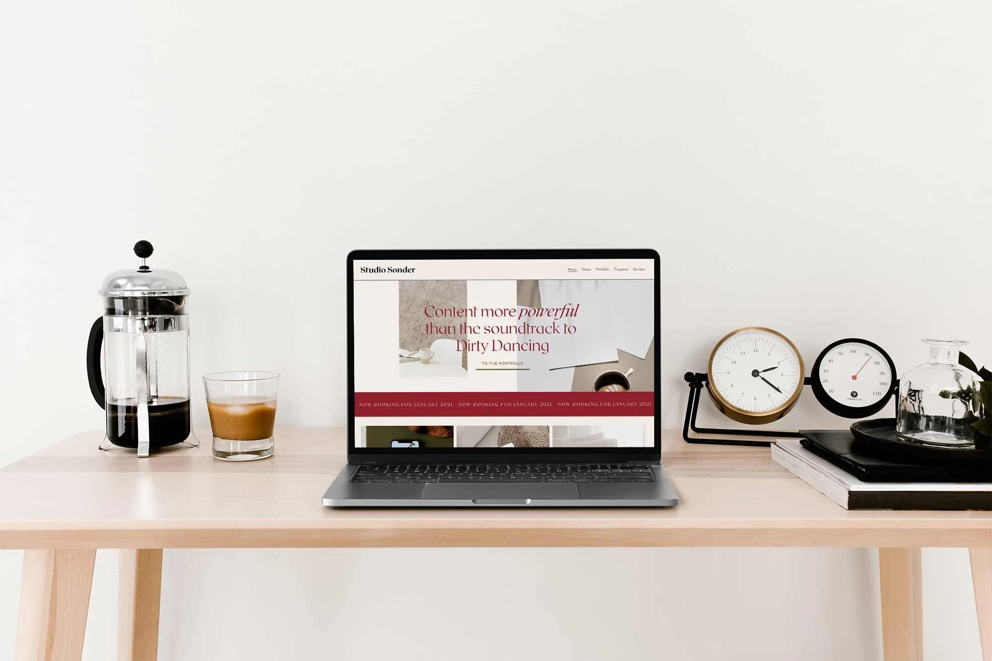
Create a site that reflected the editorial nature of Studio Sonder’s copywriting, including refreshing the look with an updated colour palette and editorial typography
Create a visually interesting copywriting portfolio as words alone can sometimes lack a bit of oomph
Updating typography and colours
The first thing we did was evaluate the typography and the colour palette choices. Charlotte provided us with a palette of colours that she liked and a few example fonts that she felt reflected Studio Sonder’s aesthetic.
We choose the rather dramatic serif font, Roxborough: this font is heavily influenced by calligraphy and hand lettering and has an editorial feel to it, which fit perfectly with Charlotte’s brief.
When going for a minimal aesthetic with your website, the power of strong typography and colour choices is essential. If you’re using lots of negative space and large, styled headings, then the font choice has to be well thought out to make sure the design feels elevated and sophisticated.
“Ruby is such a rare mix of creative and practical. She knew what I wanted better than I did! She has such strong instincts for what makes a site *really* work and honestly, it’s changed my business.”
Custom Squarespace Design Features
We used CSS flexbox to create more dynamic layouts within Squarespace’s framework. This means that we can edit the background panels in the Squarespace page-builder, to be whatever custom width that we want.
"Flexbox is a set of CSS properties that allows designers to create flexible layouts. This is great news for responsive design because it dramatically reduces the complexity of fluid grids.”
We used Squarespace’s animate feature to make all assets gently fade in as the user scrolls down the page. Adding these subtle animations to your website is a great way to create movement, and also create a little excitement, or a moment of delight, as your user interacts with your website.
On top of Squarespace’s fade-in animation, we added some other elements of movement to the website to make the site feel more interactive and fun to use. Studio Sonder has a playful way of writing, and we wanted to get that personality across with the way the website behaved.
Here are just some of the custom elements and plug-ins we added to the Squarespace website design:
We coded a custom hover effect to sit over the buttons
We made the logo smaller when the user scrolls down the page
We added scrolling banners of text under the header and in the footer so it felt like a news announcement
We used CSS 3 animation to rotate elements, such as the word ‘testimonials’ in the testimonials section
Custom Squarespace Website Stats
In total, we spent 3 weeks installing over 15 plug-ins and wrote 997 lines of custom CSS for this custom Squarespace website for Studio Sonder.
Don’t forget about mobile!
On top of this, we also added bespoke mobile code to make sure that the website works seamlessly on mobile and tablet, as well as desktop. When using lots of custom code it’s important to check that the website renders perfectly on mobile, sometimes the additional code snippets can affect Squarespace’s built-in responsiveness.
Bespoke Squarespace Training
We teach all of our clients how to use and update their website with our bespoke video training at the end of the project, all of our clients say how easy it is for them to update their website after the training. (Although we do offer Squarespace maintenance packages for those who need additional help or are too busy doing all of the other business-owner stuff.)
“Before I’d even hired Ruby, I’d had at least six people tell me about how fabulous she was to work with. And, she didn’t disappoint. From our initial meeting, Ruby just knew what I wanted - at times she understood what I was asking for better than I did! Working with her was easy and fun. I just can’t recommend her enough.”
Let’s create a Squarespace website design that you’re proud to share…
If you're interested in transforming your Squarespace website from meh to magic, then get in touch here.
Our Happy Squarespacers
Discover some of the kind words our Squarespace website designs have received below.


