The Squarespace Showcase Edit 02: Rebecca Martha Interiors
Since we launched in 2017, we’ve been using Squarespace to create beautifully bespoke websites. Over the last year, we’ve launched countless numbers of Squarespace websites, through both our bespoke website design and build service here at Studio 77, and also through our sister company Squarebase, which sell plug-and-go Squarespace website templates.
We thought it was about time we collated our favourite Squarespace websites that we’ve built and shared them with you for some Squarespace inspiration with our new series, The Squarespace Showcase!
We love using Squarespace as a platform to build our clients websites on because it’s easy for our clients to use to maintain their website, and it gives us plenty of freedom to do our thang (not that’s not a typo) with our advanced knowledge of Squarespace coding.
It really is a win-win situation!
The Squarespace Showcase 02: Rebecca Martha Interiors
In our second edition of The Squarespace Showcase, we’re shining a spotlight on interior design studio and e-commerce business, Rebecca Martha Interiors.
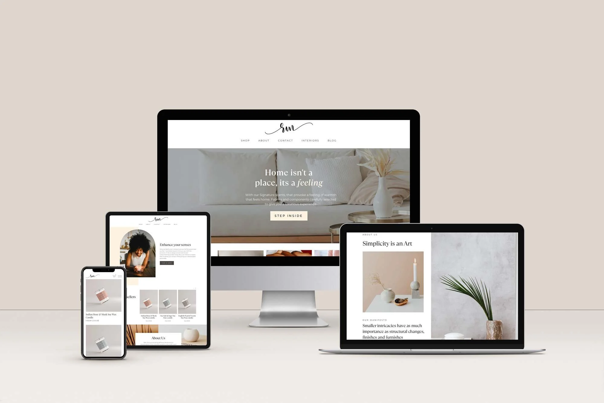
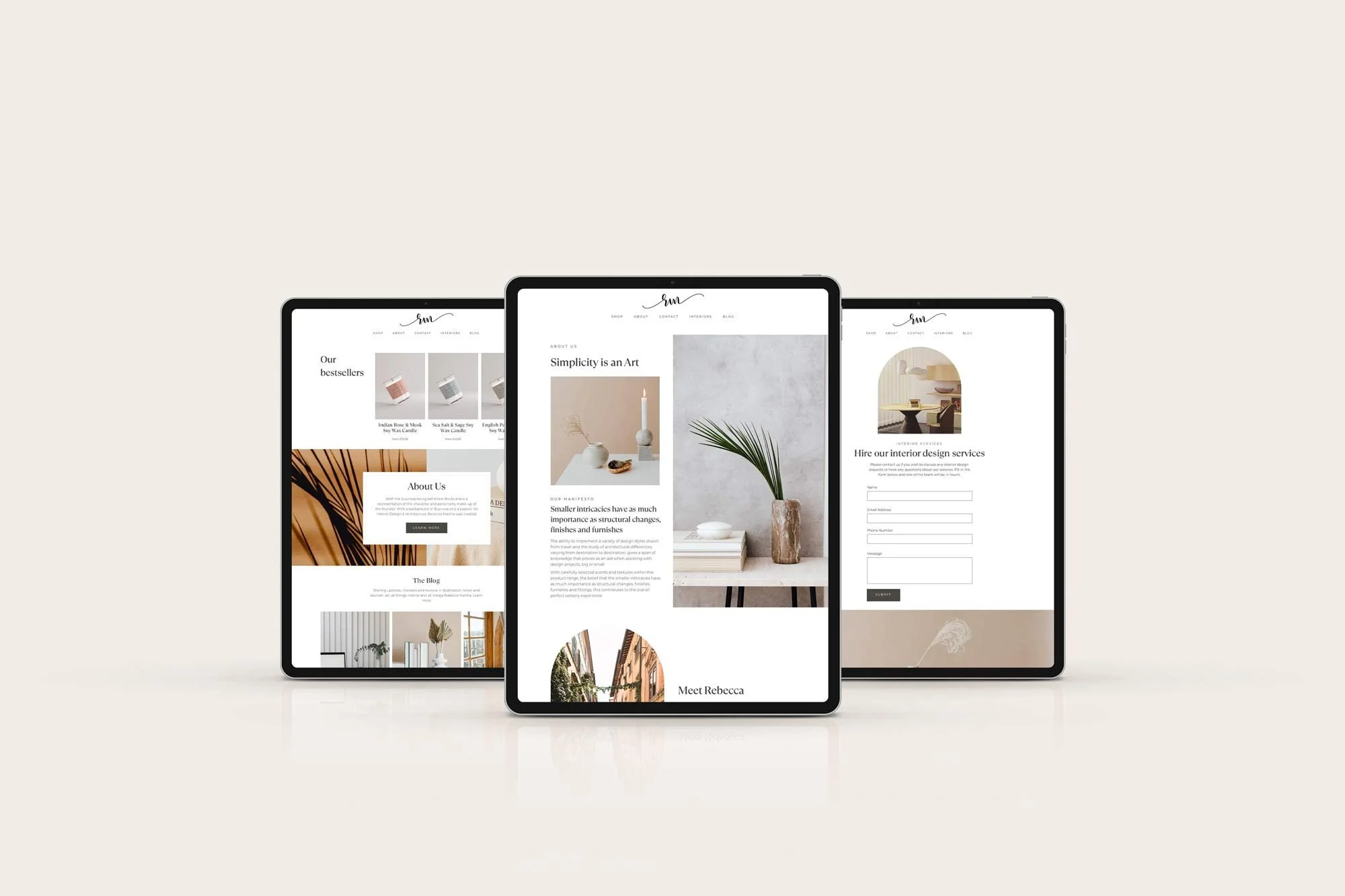
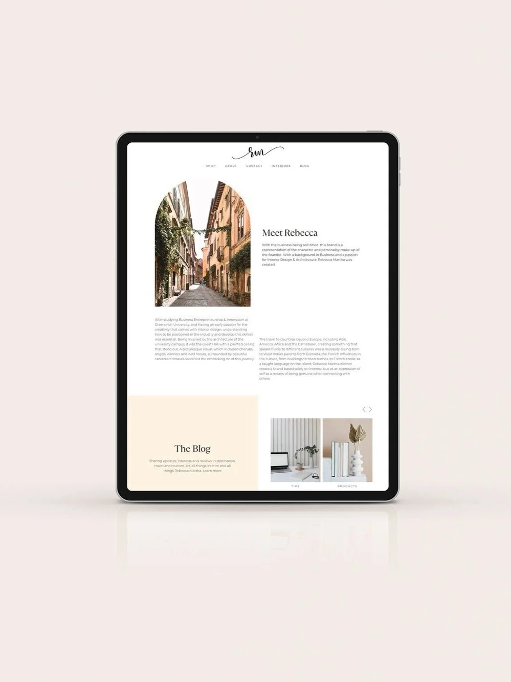
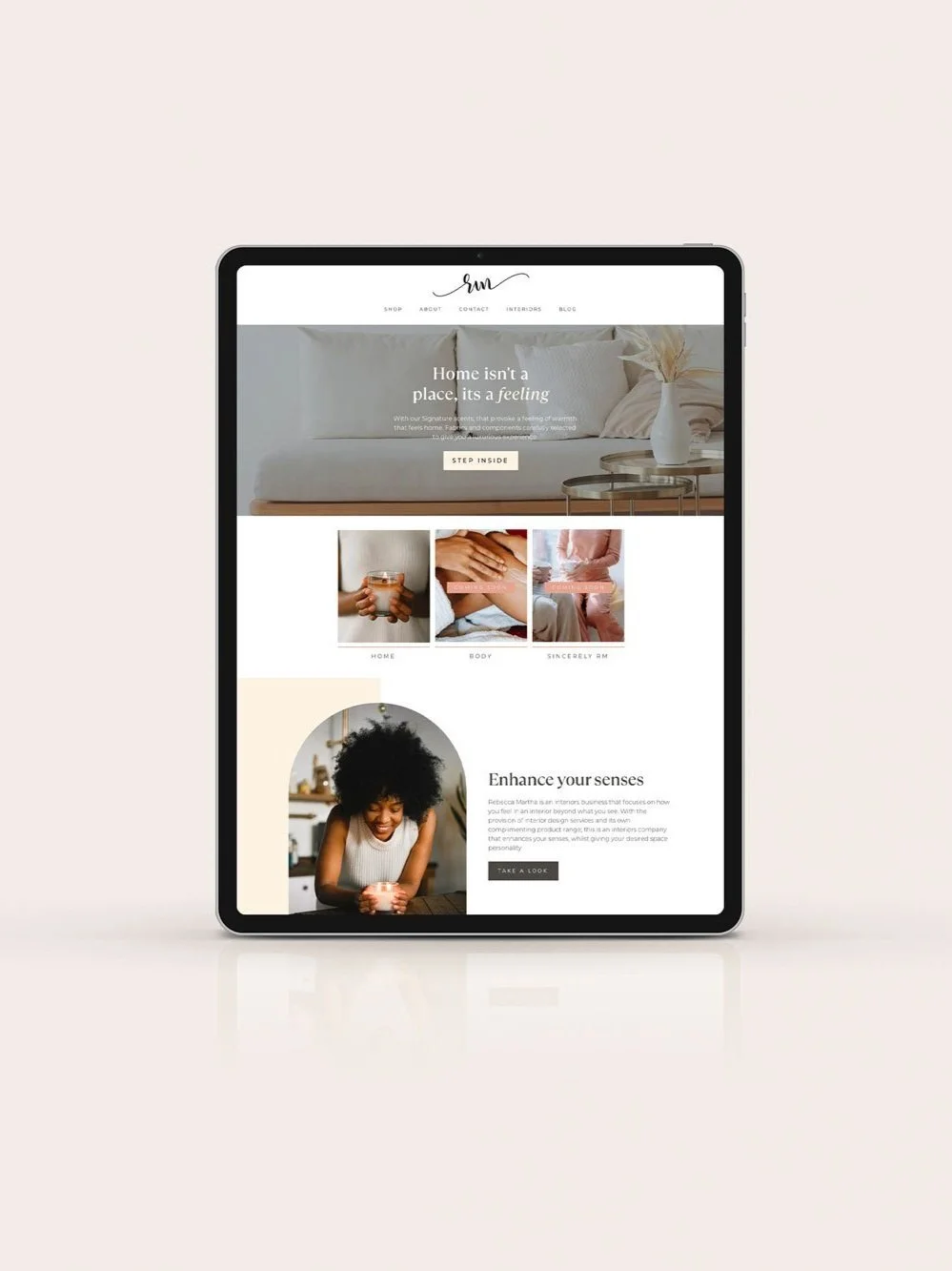
Founded by Rebecca Martha, Rebecca Martha Interiors creates a sensory experience and focuses on how you feel in your interiors, not just how it looks. RM Interiors lives by the motto ‘Simplicity is an art’ - their design style and colour palette are associated with minimalist, light and airy designs, so it’s important that we reflected that within the Squarespace website design itself.
Rebecca Martha Interiors’s Squarespace website objectives were:
Have a website that reflects the luxury and simplicity of the brand, which will compel users to purchase.
Increase repeat visits to the site, by using a blog to create a sense of community.
Increase sales on the website
Updating typography and colours
Rebecca opted for our mini digital branding package as well as our Squarespace website design service. So the first thing we did was evaluate the existing typography and the colour palette that she had her brand. Rebecca felt her current colours and fonts weren’t carrying the elegance of the brand, so we crafted a brand palette and chose a sophisticated font to reflect the luxury feel with the brand.
We choose TT Ramillas for the font, as it is a fully reconsidered high contrast transitional serif, which is perfectly suitable for a premium, and minimal, look and feel. The visual features of TT Ramillas are high contrast, small flared serifs, variable slope of ovals, open aperture of signs and contrasting thin nodules.
For the colour palette, we wanted a light tonal palette, that had a fresh luxe feel, think calming neutrals and nudes, with a little extra punch of pink that we felt resonated with her target audience.
“If you really want to see your business elevate in reach to customers and appeal, definitely worth the investment. With the timelines set, Ruby helped to ensure that all elements I requested were met with efficiency. This also included some extras that I didn’t originally request; branding and label design.”
Custom Squarespace Design Features
We used CSS flexbox to create more dynamic layouts within Squarespace’s framework. This means that we can edit the background panels in the Squarespace page-builder, to be whatever custom width that we want.
"Flexbox is a set of CSS properties that allows designers to create flexible layouts. This is great news for responsive design because it dramatically reduces the complexity of fluid grids.”
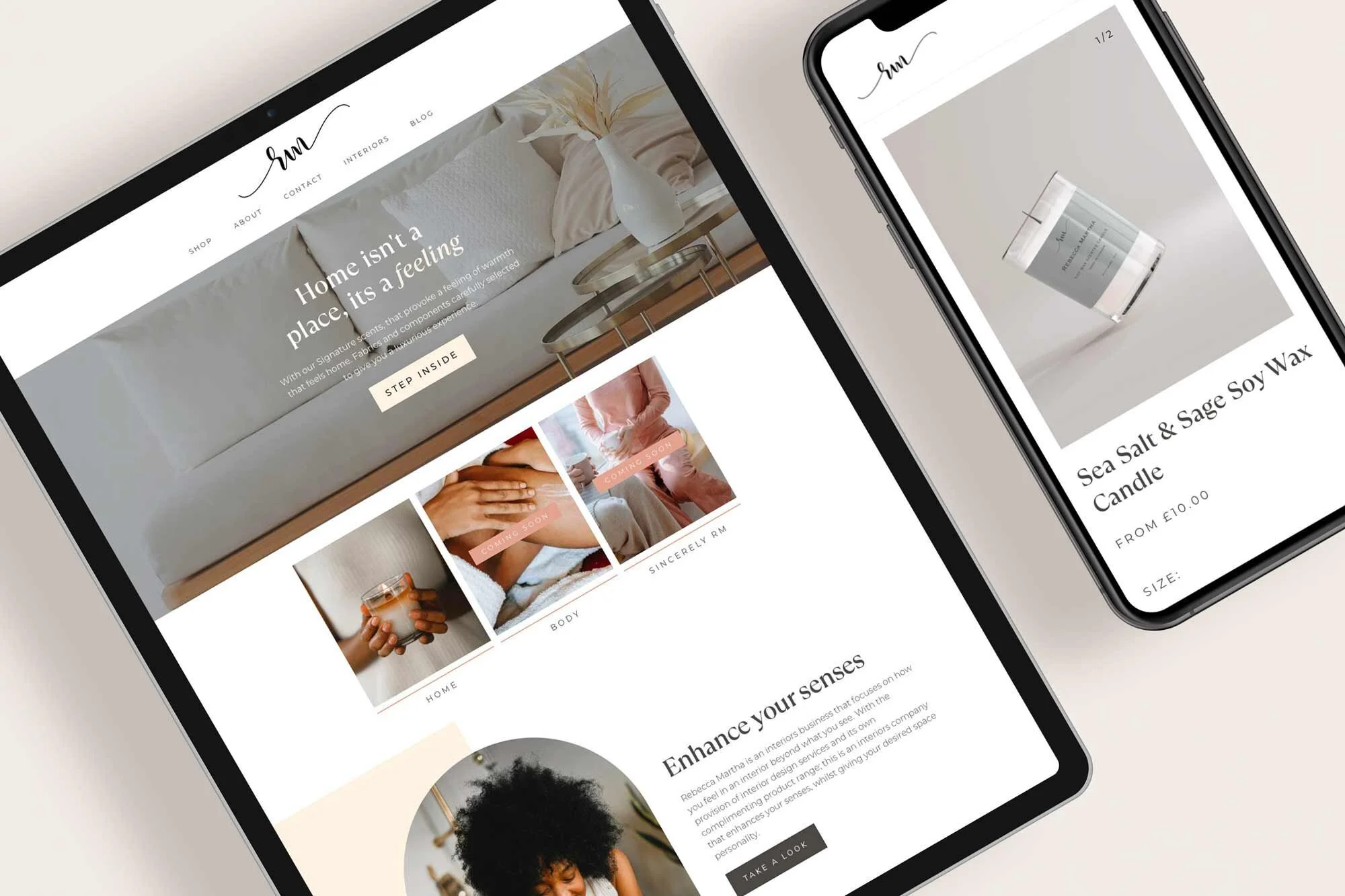
We used Squarespace’s animate feature to make all assets gently fade in as the user scrolls down the page. Adding these subtle animations to your website is a great way to create movement, and also create a little excitement, or a moment of delight, as your user interacts with your website. On top of adding custom Squarespace coding to the website, we also used custom hover effects on the buttons and images.
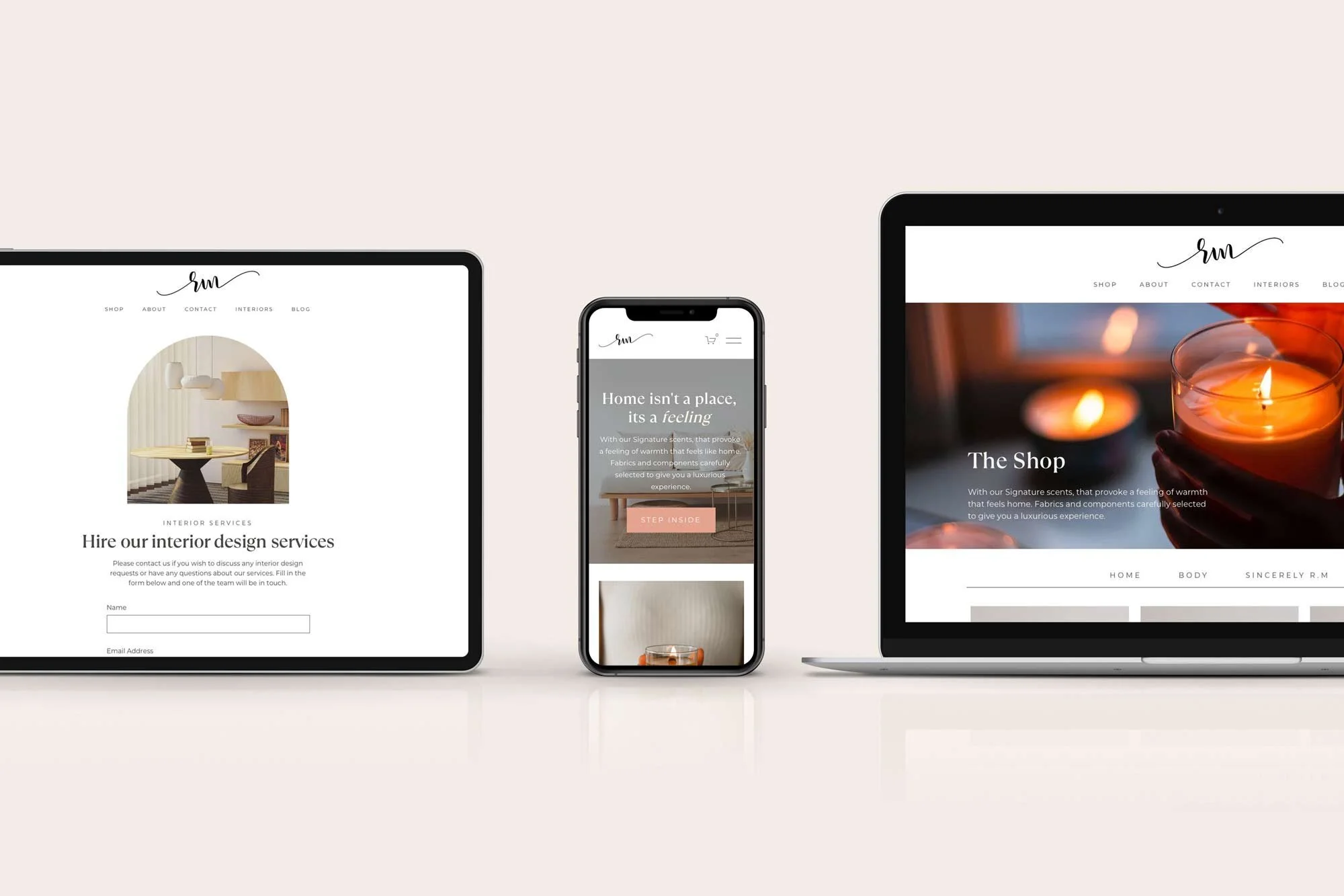
We wanted the website to feel cosy and homely, we wanted the images to appear like a window into Rebecca’s world, so we cropped a number of the images into classic arch window shapes, to allow the illusion of peering into Rebecca’s designs.
Here are just some of the custom elements and plug-ins we added to the Squarespace website design:
We coded a custom hover effect to sit over the buttons
We made the logo smaller when the user scrolls down the page
We used subtle hover animations over clickable images
Custom Squarespace Website Stats
In total, we spent 3 weeks installing over 7 plug-ins and wrote 334 lines of custom CSS for this custom Squarespace website for this interior design Squarespace website
Don’t forget about mobile!
On top of this, we also added bespoke mobile code to make sure that the website works seamlessly on mobile and tablet, as well as desktop. When using lots of custom code it’s important to check that the website renders perfectly on mobile, sometimes the additional code snippets can affect Squarespace’s built-in responsiveness.
Bespoke Squarespace Training
We teach all of our clients how to use and update their website with our bespoke video training at the end of the project, all of our clients say how easy it is for them to update their website after the training. (Although we do offer Squarespace maintenance packages for those who need additional help or are too busy doing all of the other business-owner stuff.)
“Ruby created cohesion across my business with both my website and package design that I am extremely happy with - she really has delivered 5-star service undoubtedly 😁 both my thumbs up!!”
Let’s create a Squarespace website design that you’re proud to share…
If you're interested in transforming your Squarespace website from meh to magic, then get in touch here.
Our Happy Squarespacers
Discover some of the kind words our Squarespace website designs have received below.

